Better employee health by design
Bringing cohesion to Personify Health’s wellness app
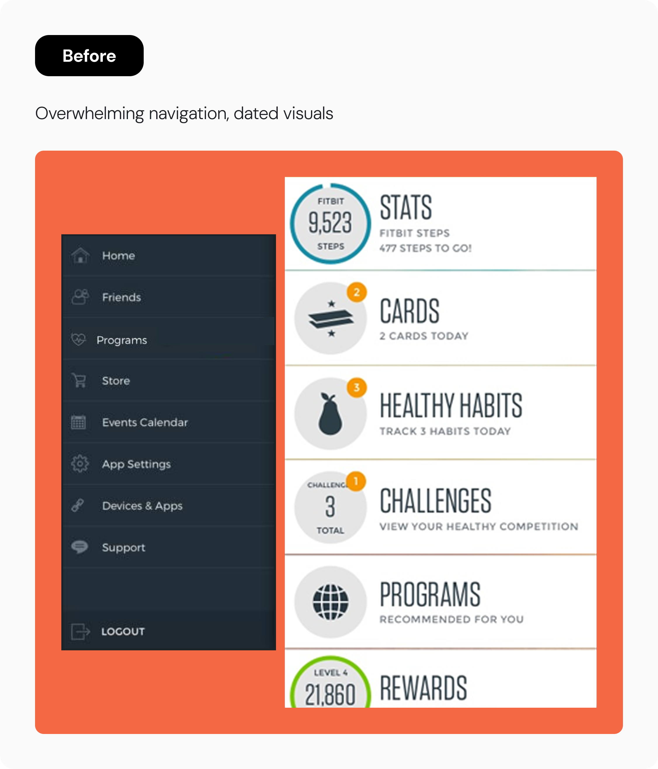
Virgin Pulse (now Personify Health) blends software and wearables to improve member wellness, but the app experience didn’t match the mission. Navigation was confusing, features were scattered, and branding was outdated and inconsistent. Teams were UX-driven, but without a design system in place, they duplicated efforts in siloes.
As design manager, I led 4 teams in redesigning the Home and Health landing pages, achieving WCAG compliance, and establishing governance guidelines for the company’s first centralized design system.
Background
01 Strategy
Set the purpose of pages before defining patterns
02 Design decisions
Build for modularity, motivation, momentum
03 Impact
Delight for users, speed for teams
Outcomes
↙duplication
Fewer bespoke components
↗ navigation ease
According to user self-report
70%
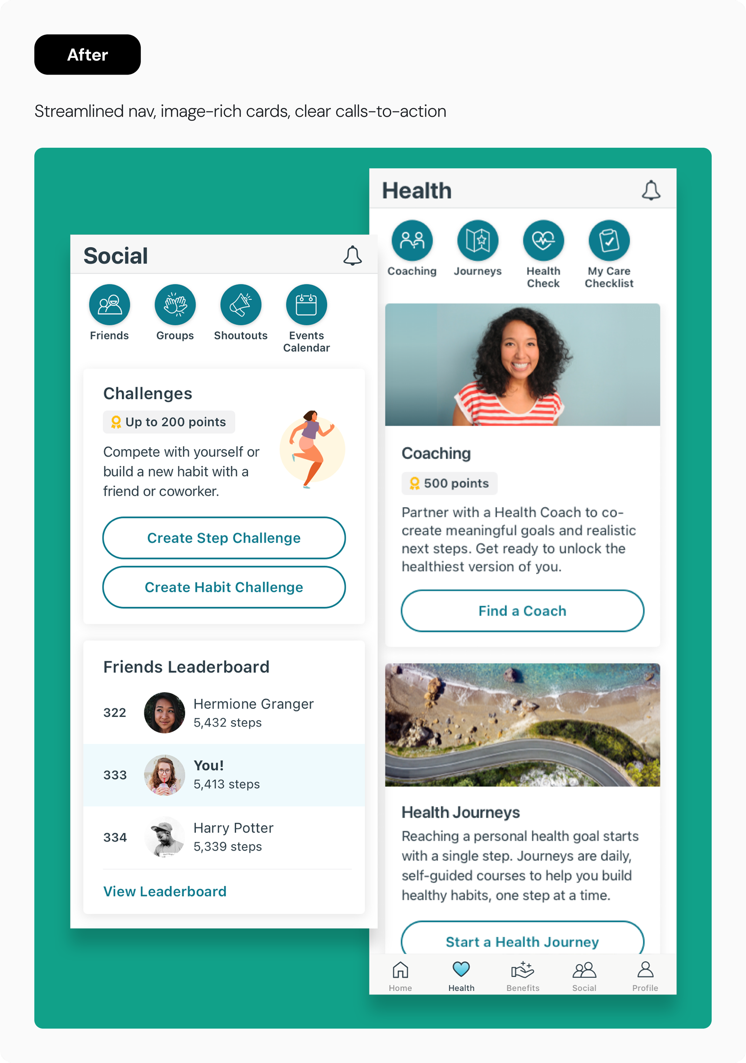
Reduction in navigation items
01 Strategy
Set page purpose before defining patterns
I led with meaning—not menus—grounding us in real members’ mental models.
Before touching IA, I facilitated cross-functional workshops with 2 teams to align around what mattered most to users. This reframed our approach—from optimizing navigation to designing motivation-driven flows. I partnered with a research lead to run card sorts and tree tests that revealed how users naturally organize information. The app’s architecture evolved to reflect the thinking of real members, not our assumptions.
I built design and development velocity through foundations.
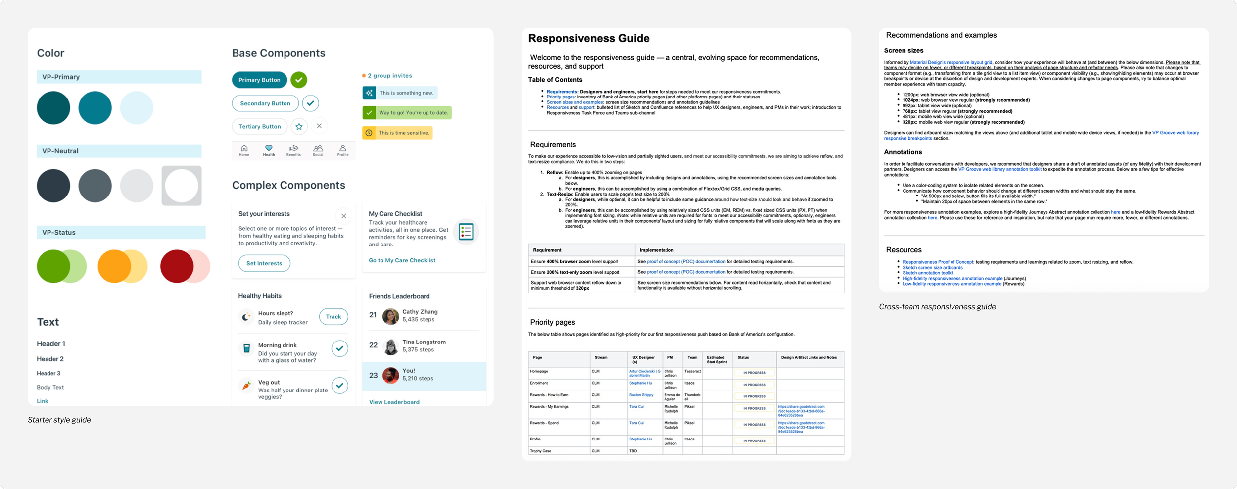
I created a flexible style guide that became the seed for the design system, accelerating team output and strengthening product cohesion. Using that proof of concept, I grew my team, hiring a new product designer to build out the design system.
Simultaneously, I led a WCAG compliance initiative to make the web experience both responsive and accessible under a tight deadline. I developed documentation that outlined accessibility standards (zoom, reflow, text resize), identified priority pages, and provided screen size recommendations, annotation examples, and reusable resources. Designers, engineers, and PMs used the documentation as a shared reference point, streamlining collaboration and ensuring we hit our deadline.
02 Design decisions
Build for modularity, motivation, momentum
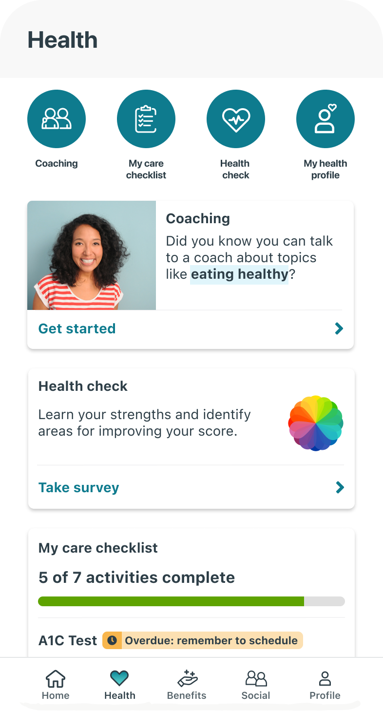
Depth, flexibility, and personalization
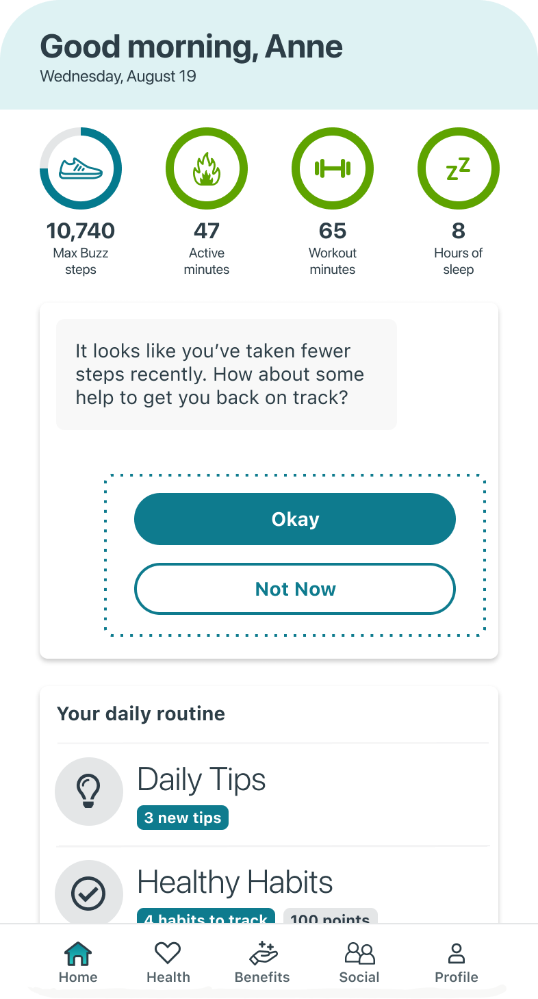
I defined the strategy for balancing user goals and business needs (sometimes at odds with one another). My team introduced a modular, adaptive layout system that flexed to individual health journeys and employer objectives, ensuring the experience felt tailored while maintaining consistency across audiences.
Prioritize points, progress, and pals
Research revealed that process indicators, social connection, and rewards drove sustained engagement. Teams brought points, streaks, and leaderboards into the core experience, turning abstract motivation into visible, actionable momentum.
03 Impact
Delight for users, speed for teams
“The style is clean. It’s more like other apps I’m used to now.”
“Ooo! I love this. Everything looks so tappable.”
Following the redesign, the majority of surveyed users reported it was easy or very easy to find what they needed, marking a meaningful shift from the app’s previous structure.
Behind the scenes, the new design system cut down on one-off implementations and improved communication across siloed product groups.